Hi! I‘m
Arnold Rauers.
Since 2012 I create mobile games
with various talented people
as Tinytouchtales.

We've made GUNCHO, Geo Gods, Card Crawl Adventure, Gnomitaire, Maze Machina, Miracle Merchant, Card Thief, ENYO and Card Crawl which are available on the App Store and Google Play.
I publish Game Jam games and showcase my game ideas and prototypes on Itch.io.
If you would like to support me and my work consider becoming a Patron.
You can subscribe to my Newsletter, follow me on Twitter, Instagram or TikTok and join our Discord community.
2014-09-20 - Tinytouchtales
Weekly Update #27
Hello, this is Weekly Update #27. This week we want to write a bit about the way we handle the new screen sizes which were introduced with the iPhone 6 and 6+.
One screen size to rule them all
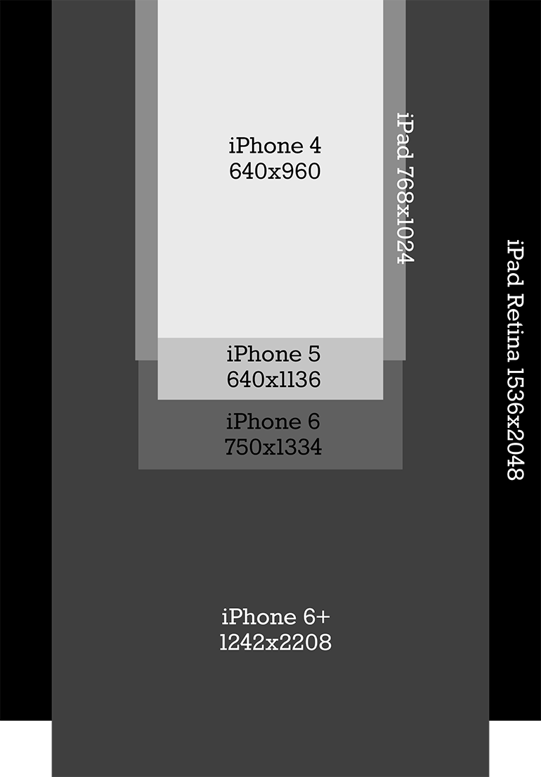
With the recently introduced iPhone 6 and 6+ two new screen sizes have been added to the pool of 4 sizes. Both of the new iPhones have a screen ration of 16:9 just like the iPhone 5. The iPhone 6 has a screen size of 750px width and 1334px height, the iPhone 6+ is way larger with 1242x2208px. To get a feeling for all 6 devices we have created a simple size comparison in Photoshop first:

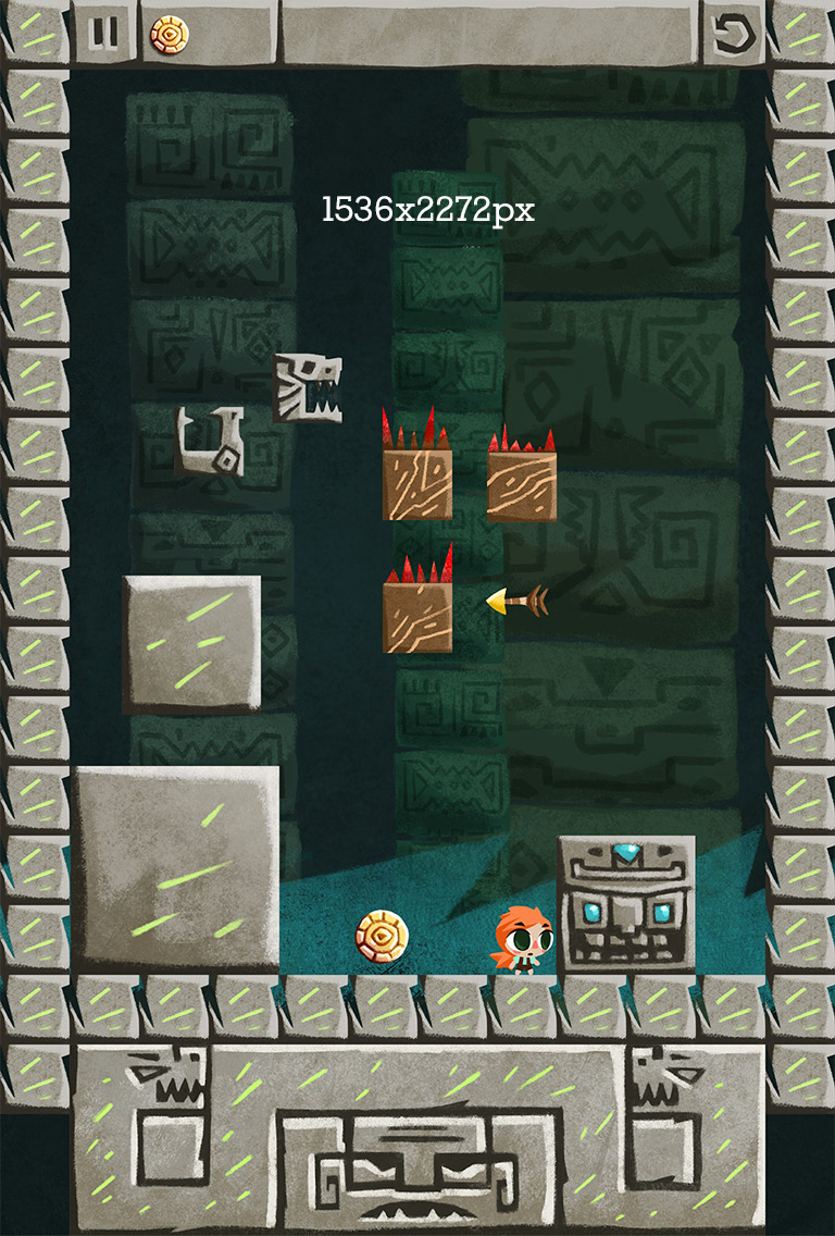
After some tests we found out that the simplest solution for creating a very flexible screen design for all sizes, is to create assets on the highest possible resolution and scale down / cut from there. To create a new “master” resolution we take the width from the iPad Retina (Portrait) 1536px and for the height we use the double of the iPhone 5 height which is 2272px. This has the advantage that we can scale down by 2 to support the smaller iPhone resolutions and for the iPad Retina and the iPhone 6+ we just cut away content. Our new Master file looks like this now:

Scale & cut
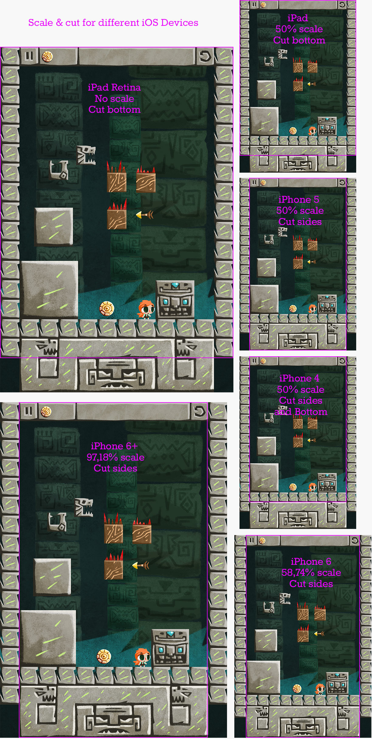
Designing for multiple screen sizes always includes thinking about how to fill and cut parts of your interface. Especially when your design, for example Zuki’s Quest, is based on a very rigid grid that can’t be scaled or changed for each device size. We started from the smallest resolution and created filler assets to display something for the larger screen sizes. Here is a comparison how the master resolution is scaled and cut down for each devices:

As seen from the graphic we scale and cut for each device. One minor flaw are the uneven scaling factors for the new iPhones. Unfortunately its not possible to scale them on even numbers with this approach, so we scale the game to the correct height and scale the width accordingly to it. In this scenario we loose one pixel on the side, where the game view cuts this one pixel from the original design. But as we know on retina devices one pixel is practically not visible and so we have a pretty good solution to deal with each devices size.
In our scenario we use Unity with the 2D Toolkit which does a great job on handling the different screen sizes, positioning of the game view and also the scaling for each device. Depending on what tools you will use, things might be a bit different, but you get the general idea:
One set of assets, scale and cut to fit the different devices.
Thats it for this week, we hope you like this small “technical” writeup and to see you next week!